
In this video, we'll be looking at how to adding an accordian to your Squarespace site. Here we have listed an accordian example with three buttons in which each one has a brief content. Now, go to the default page. The first step is to add the HTML that will display the acordian, so click on the backend of the site, hover over the page content section, click on "EDIT", hit the plus icon and search for "code". Click on "Code" icon and here we're gonna type the HTML code for the accordian. Below the button class code, you have to write the title of the button label, in this case "Section 1"; below the div class code you can write the content you want to display and if you want to add another button label just copy all the code and paste it below, once you have finished just click on "Apply" and also hit "Save " on the page element. Now, the accordian has been displayed but it doesn't work correctly, to implement hide and show action, we need to add some CSS and Javascript. To do that, we have to go to "Settings" in the left panel, then scroll down to "Advanced" and next click where it says "Code injection"; first we're gonna add our CSS code which we have to write in the Header field. Within that code you can customize the background color, font color, pointer, padding, width, text align, border, outline and transition time of open-close buttons in the accordian panel and after you have finished click on "Save" to see the changes. Now, we have to write the codes to modify the panel sections and after that click again on "Save". You can see that the accordian is updated but it doesn't display the content, we need to add some Javascript to achieve it. Scroll down to the Footer section and in the field you have to add the codes, these will allow you to assign functions to the panel elements such as click enabling and toggle showing or hiding, then just click on "Save". Check the accordian and now it should work perfectly, if you write the codes properly the accordian buttons should be enabled with a click, they should show the contents and the colors should change when hovering over and clicking. To provide a better visual experience, you can add plus and minus icons within the buttons, to do that, go back to the Header section and add the code. You can customize the color, position, alignment and size of the icons as well as changing from each to another once the button is activated, click on "Save" and now the accordian is ready.
Squarespace Tutorial: How to add an accordian
Step 1: Click on “EDIT”

First of all, in your Squarespace site, you have to open the edit tools by clicking on the top left corner icon, now you can hover on the site elements, then click on “EDIT”.
Step 2: Click on “Code”

To see this option, you will have to go to the top right corner and click on the “+” icon, this will open a new tools box where you’ll be able to type “Code” in order to make it easy to find it, then click on the “Code” option.
Step 3: Enter “Adding sections” Code

In this box, you have to enter the code that will add a section button, remember to use the HTML option, you can just copy the code that is below.
<button class=”accordian”>
Section 1
</button>
<div class=”panel”>
<p>
Lorem ipsum…..
</p>
</div>
Step 4: Copy and paste the code, only editing the section number
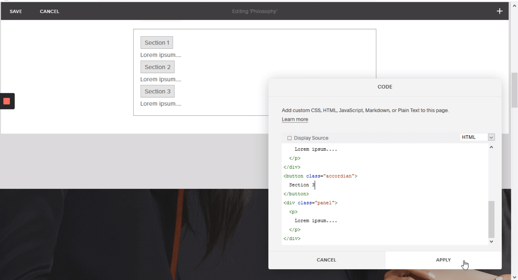
You can just copy and paste the previous code the times you need, only remember that “Section 1” was an example of the label, so I wrote “Section 2,3” for the next buttons.
Step 5: Go to the backend interface and open “Code injection”

In the left panel of your editor mode, you have to click on “Settings”, then click on “Advanced” and finally you have to click on “Code Injection”.
Step 6: Enter the CSS code
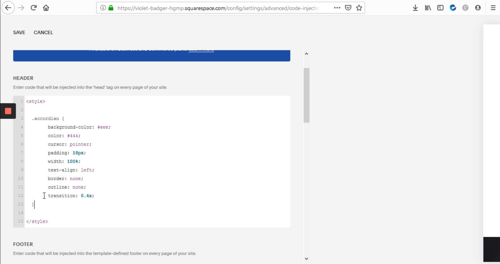
Now, some code boxes will be displayed, you have to go to “HEADER” box and write here the features you want to the button displays, such as, background color, kind of cursor, padding size, width size, text alignment, etc. The code should look like the next one:
<style>
.accordian {
background-color: #eee;
color: #444;
cursor: pointer;
padding: 18px;
width: 100%;
text-align: left;
border: none;
outline: none;
transition: 0.4s;
}
</style>
Step 7: Add some customization to your section buttons

Here I added the panel features, in this case, the code I added is the following.
.panel {
padding: 0 18px;
background-color: white;
display: none;
overflow: hidden;
}
.active, .accordian:hover {
background-color: #ccc;
}
Step 8: Go to “FOOTER” and enter the Javascript code

At this point, we need to make those section buttons clickable to interact and dropdown the content and add some other variables to make it more dynamic, so, you have to go to “FOOTER” box to enter this Javascript code.
<script>
var acc = document.getElementsByClassName (“accordian”) ;
var i;
for (i = 0; i < acc.length; i++) {
acc[i].addEventListener(“click”, function() {
this.classList.toggle(“active”);'
var panel = this.nextElementSibling;
if(panel.style.display === “block”) {
panel.style.display = “none”;
}
else {
panel.style.display = “block”;
}
});
}
</script>
Step 9: Add plus icon to your sections
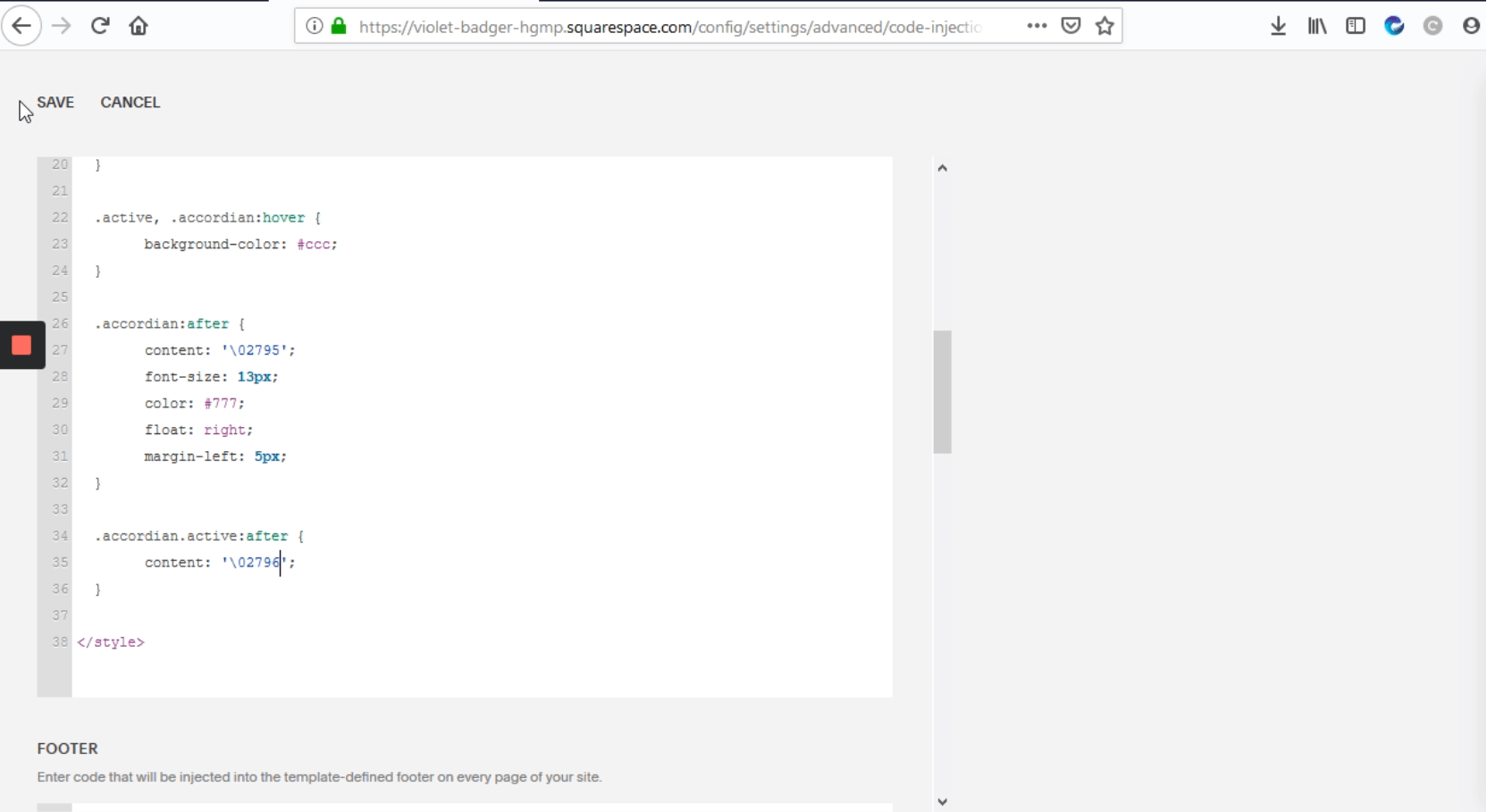
Now I want to add a “Plus” icon and a “Less” icon on the right side of the section buttons, so we have to go back to "HEADER" and add the following code:
.accordian:after {
content: '\02795';
font-size: 13px;
color: #777;
float: right;
margin-left: 5px;
}
.accordian.active:after {
content: ‘\02796';
}
</style>
Step 10: Save and check the results
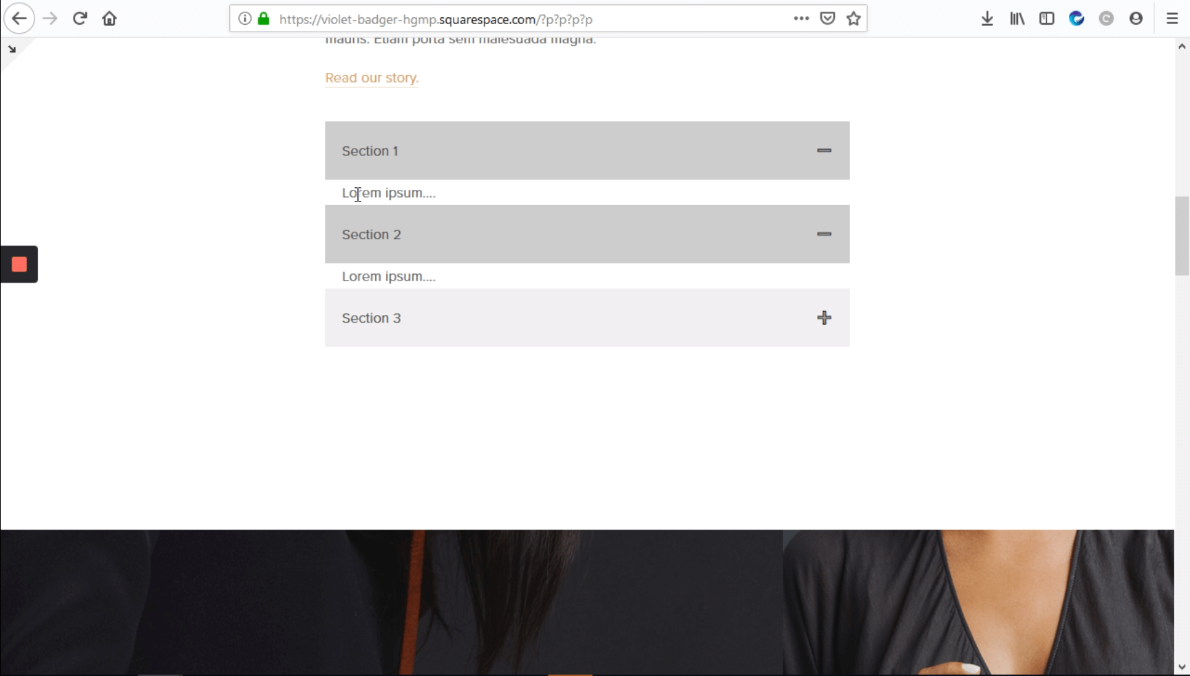
Once you’ve done all the steps, just save the changes and your site should display a functionally accordian.
The entire code should look like this:
HEADER
<style>
.accordian {
Background-color: #eee;
color: #444;
cursor: pointer;
padding: 18px;
width: 100%;
text-align: left;
border: none;
outline: none;
transition: 0.4s;
}
.panel {
padding: 0 18px;
background-color: white;
display: none;
overflow: hidden;
}
.active, .accordian:hover {
Background-color: #ccc;
}
.accordian:after {
content: '\02795';
font-size: 13px
color: #777;
float: right;
margin-left: 5px;
}
.accordian.active:after {
content: ‘\02796';:
}
</style>
FOOTER
<script>
var acc = document.getElementsByClassName (“accordian”) ;
var I;
for (i = 0; i < acc.length; i++) {
acc[i].addEventListener(“click”, function() {
this.classList.toggle(“active”);
var panel = this.nextElementSibling;'
if(panel.style.display === “block”) {
panel.style.display = “none”;
}
else {
panel.style.display = “block”;
}
});
}
</script>

Stay updated with our
latest news & offers
Sign up to get our Newsletter.

.png)